Chapter 5 Plotting
R offers a huge set of procedures for visualizing data. Many of these procedures are very complex and designed for specific data structures (see here for some inspiration). Many of these specialized functions rely on a set of basic plotting routines. In this chapter plotting with the basic R plotting routines and plotting with ggplot2 is briefly outlined.
5.1 Basic plotting routines
Basic plotting routines in R rely on classic coordinate plotting. I.e. vectors with x- and y-coordinates are passed to plotting routines to produce lines, points, polygons, etc. The following table briefly outlines a set of basic plotting rotines.
| function | description |
|---|---|
plot(x,y) |
opens a plot device, x and y are coordinate vectors (default produces a scatterplot) |
points(x,y) |
adds points to an existing plot |
lines(x,y) |
adds lines to an existing plot, points are successively connected by straight line segments |
abline(a,b) |
adds linear function with intercept a and slope b |
curve(expr, from, to) |
plots function expr (with first argument x) in the range from to to |
segments(x0,y0,x1,y1) |
draws an line segments from \((x_0, y_0)\) to \((x_1,y_1)\) (can also be vectors) |
arrows(x0,y0,x1,y1) |
draws an arrow from \((x_0, y_0)\) to \((x_1,y_1)\) |
polygon(x,y) |
similar to segments, but coordinates are given in vectors x and y, last point is automatically connected to first point |
pie(x) |
draws pie chart based on vector of shares x |
barplot(height) |
draws bars whose height is given in the vector height |
hist(x) |
draws histogram based on numeric vector x (raw data), classes are determined automatically (unless they are manually defined) |
boxplot(x) |
parallel boxplots based on data in list ‘x’, each element of x contains a numeric vector |
To change the appearance of basic plotting device, all basic plotting routines rely on a set of graphical parameters which can be accessed via ?par To change, for instance, plotting margins or the number of plots within a single plotting device, par(<setting>) can be executed before the first plot command is executed.
Simple scatter plots can be produced as follows
# very simple scatter plot
n <- 50                 # number of points to plot
x <- rnorm(n)           # independent x coordinates
y <- rnorm(n)           # independent y coordinates
plot(x, y, xlab ="x", ylab = "y") # xlab and ylab define axis labels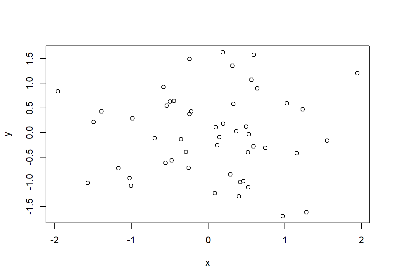
# a still simple data set
n <- 50                                 # number of points to plot
x <- rnorm(n, 10 , 2)                   # independent x coordinates
y <- 2*x + rnorm(n, 0, sqrt(x))         # linearly dependent y coordinates with heteroscedastic errors
par(mfrow = c(1,2))                     # set up a device with 2 plots
plot(x, y, xlab ="x", ylab = "y", type ="l", main = "unstructured")  # one can also plot lines and a title
plot(x[order(x)], y[order(x)], xlab ="x", ylab = "y", type ="b", main = "structured")     # as well as points and lines
lin.reg <- lm(y~x)                      # fit a linear regression model
abline(lin.reg, col = "red", lwd =2)    # ... and plot the regression line
mtext(text = paste("est. regression: ", round(lin.reg$coefficients[1],1), "+", round(lin.reg$coefficients[2],1), "*x", sep = ""), side = 3) # and add the formula as text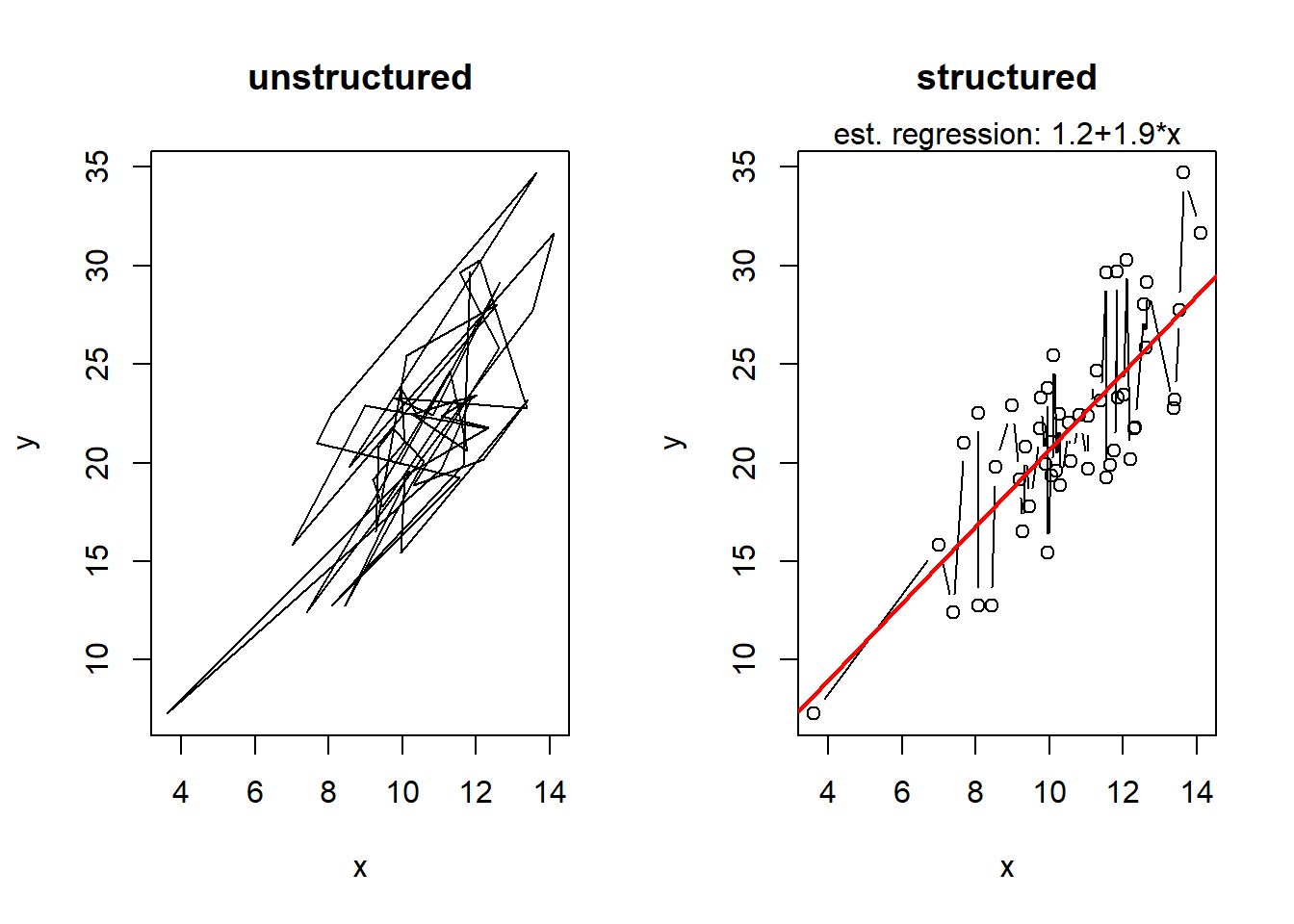
Exercise 1: Sample 100 observations in the range \([-3,3]\) from the follwing model and plot the sample: \[ y = \sin(3 \cdot x^2 - 4) \cdot x + 0.5 \cdot x + \epsilon \] whereby \(\epsilon \sim N(0,0.5)\) Can you estimate a regression function?
When plotting a function, one can use basic plotting routines or, as a shortcut, curve().
# plot a normal distribution
man.norm <- function(x, mu = 0, sigma = 1)   1/sqrt(2 * pi * sigma^2) * exp(-(x-mu)^2/2/sigma^2)     # density function normal distribution, self-written, default to standard normal
n <- 100                                # set number of points for function plotting
x <- seq(-3, 3, length.out = n)         # set plotting range (-3,3) and sample n equally spaced points
y <- man.norm(x)                        # calculate density at x-values
par(mfrow = c(1,2))                     # set up a device with 2 plots
plot(x, y, xlab ="x", ylab = "density", type ="l", main = "stand. normal density (self-written)")
curve(dnorm, from = -3, to = 3, main = "stand. normal density (built-in)")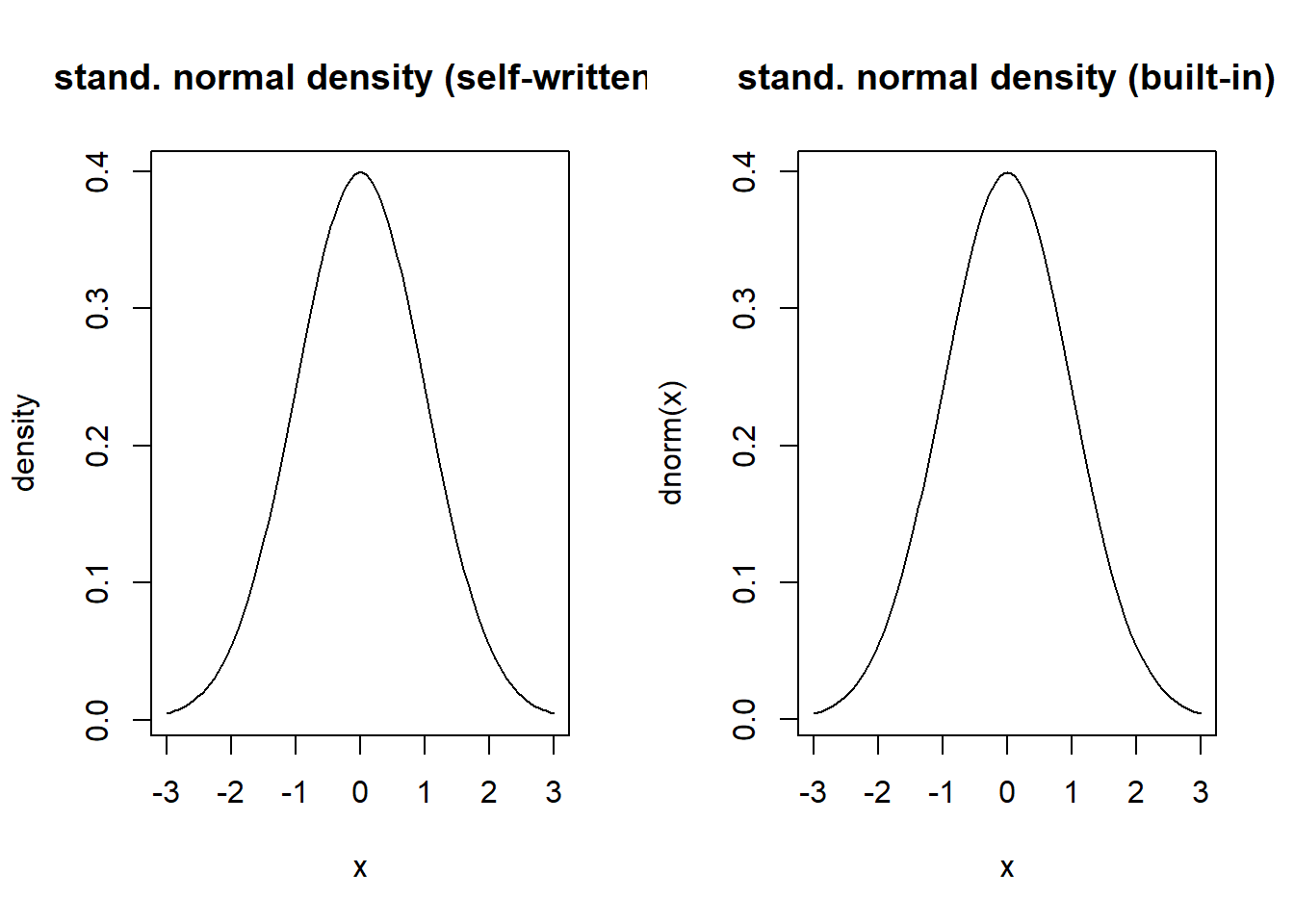
Exercise 2: Plot the EOQ model in an appropriate range.
Exercise 3: Plot the newsvendor model \[ Z(q) = \left(c_u + c_o \right) \cdot \sigma \cdot \left( \varphi(q') + q' \cdot \Phi(q') \right) - c_u \cdot (q-\mu) \] with \(q' = \frac{q-\mu}{\sigma}\) in an appropriate range. Hint: Choose reasonable values for \(c_u\), \(c_o\), \(\mu\), and \(\sigma\).
Of course, one can easily overlay different plots.
# plot a normal distribution
n <- 50                                 # sample size
x <- rnorm(n)                           # sample from standard normal distribution
est.mu <- mean(x)                       # estimate mean
est.sd <- sd(x)                         # estimate standard deviation
# plot histogram with density (default plots frequencies), specify plot range explicitely
hist(x, freq = FALSE, ylim = c(0,0.5), xlim = c(-3,3), main = paste("Histogram of x, sample size =", n))
# add theoretical density
curve(dnorm, from = -3, to = 3, col = "red", add = TRUE)
# add estimated density
curve(1/sqrt(2 * pi * est.sd^2) * exp(-(x - est.mu)^2/2/est.sd^2), from = -3, to = 3, col = "blue", add = TRUE)
# add a legend
legend("topleft" , bty="n", col=c("blue","red"), lwd =c(1,1), legend = c("estimated density", "theoretical density"))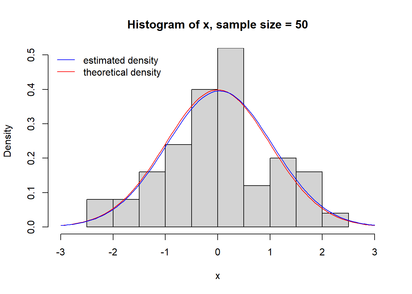
Exercise 4: Plot the EOQ model in an appropriate range and add holding cost function and ordering cost function in different colors. Add a legend to the plot.
Exercise 5: Consider the in the joint economic lot size model. Supplier and customer face setup costs (\(c^{sup.}_{set}\) ,\(c^{cust.}_{set}\)) as well as stock-holding cost rates (\(c^{sup.}_{sh}\), \(c^{sup.}_{sh}\)). The demand rate of the customers is \(\lambda\) and production rate of the supplier is \(\mu\) (with \(\lambda < \mu\)). The cost functions of supplier and customer are \[C^{cust.}(q) = \frac{\lambda}{q} \cdot c^{cust.}_{set} + c^{cust.}_{sh} \cdot \frac{q}{2} \] and \[C^{supp.}(q) = \frac{\lambda}{q} \cdot c^{sup.}_{set} + c^{sup.}_{sh} \cdot \frac{q}{2} \cdot \frac{\lambda}{\mu} . \] Plot the cost functions of supplier, customer, and the SC (i.e., total cost function) in different colors. Add a legend to the plot.
Overlays are also useful when plots should be customized.
# plot a normal distribution with annotation
n <- 1000                               # set number of points for function plotting
x <- seq(-4, 4, length.out = n)         # set plotting range (-3,3)
y <- dnorm(x)                           # calculate density at x-values
q95 <- qnorm(0.95)                      # 95%-quantile
x.sub <- x[x > q95]                     # subset with x > 95%-qunatile
y.sub <- y[x > q95]                     # subset of corresponding density values
# close polygon by adding point (q95, 0)
x.sub <- c(x.sub, q95)
y.sub <- c(y.sub, 0)
# plot density
plot(x, y, xlab ="x", ylab = "density", type ="l", main = "stand. normal density with 95% quantile")
polygon(x.sub, y.sub, col="red")                    # highlight 5%-area
abline(v = q95, col ="darkgrey", lty = 2, lwd= 2)   # highlight coordinate of 95% quantile as grey, dashed line
par(xpd = TRUE)                                     # change device, allows annotations outside plot area
text(x = q95, y = -.0375, labels = paste("95%-quantile =", round(q95,2)))  # add text to axis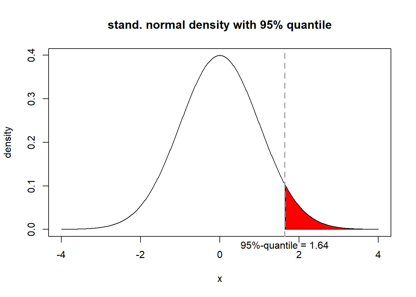
Exercise 6: Consider the contract design problem with buy-back option (Thonemann, 2010, p. 479). Given are unit cost per product unit \(c\) of the supplier, the sales price of the supplier \(w\), the sales price of retailer \(r\), the scrap revenue \(v\) of the SC as well as normally distributed demand with \(y \sim N(\mu, \sigma^2)\). To be determined is the buy-back price \(b\) such that the optimal profit of the SC is generated. The optimal SC profit is obtained if the retailer orders \(q=\mu + \sigma \cdot \Phi^{-1}\left( CR \right)\) units, whereby \(CR = \frac{r-c}{r-v}\) is the SC’s critical ratio. For the optimizing buy-back price \(b\) holds: \[ b(w) =-r \cdot \frac{c-v}{r-c} + w \cdot \frac{r-v}{r-c}\]. The profits of retailer and supplier in case of optimal combinations of \(b\) and \(w\) holds \[G^{ret.}(w)=(r-w) \cdot \mu - (r-b) \cdot \sigma \cdot \Phi^{-1}\left( CR \right)\] and \[G^{sup.}(w)=(w-c) \cdot \mu - (b-v) \cdot \sigma \cdot \Phi^{-1}\left( CR \right).\] Plot the profit functions of retailer and supplier as well as the buy-back price function depending on \(w\).
5.2 ggplot2
The package ggplot2 offers powerful procedures for creating plots from well-structured data quickly. For a definition of what ‘well-structured’ or ‘tidy’ data, see here. It is designed ease handling with data frames and tibbles. Therefore, the plotting syntax is fundamentally different from R’s basic plotting routines. For an extensive introduction see here or here. For a cheat sheet see e.g. this link. In principle, ggplot requires three elements for plotting:
1. data set
2. coordinate system
3. geometrical object(s)
Basically, there are two plotting routines in ggplot: the general ggplot() + <geom>() option or the shortcut via qplot(). Geometrical objects are numerous. The most prominent are summarized below
| geometrical object | ggplot function |
basic plotting analog |
|---|---|---|
| points | geom_points() |
points() |
| lines | geom_path() |
lines() |
| histogram | geom_histogram() |
histogram() |
| boxplot | geom_boxplot() |
boxplot() |
| barplot | geom_barplot() |
barplot() |
| linear function | geom_smooth(method ="lm") |
abline() |
| general function | stat_func() |
curve() |
The coordinate system is refered to as aesthetics in ggplot and directly controled via aes(). However, all geometry objects as well as ggplot() and qplot define the coordinate system in the same way by defining the variables of the underlying data set which refer to the x and y coordinate to draw. The data set is determined via the argument data = in ggplot() and qplot().
library(tidyverse) # load tidyverse which also includes ggplot2## Warning: Paket 'tibble' wurde unter R Version 4.1.2 erstellt## Warning: Paket 'tidyr' wurde unter R Version 4.1.2 erstellt## Warning: Paket 'readr' wurde unter R Version 4.1.2 erstellt## Warning: Paket 'dplyr' wurde unter R Version 4.1.2 erstellt# very simple scatter plot
n <- 50 # number of points to plot
dat <- tibble(x = rnorm(n), y = rnorm(n)) # data set with independent x and y coordinates
qplot(x = x, y = y, data = dat) # similar scatterplot as with plot()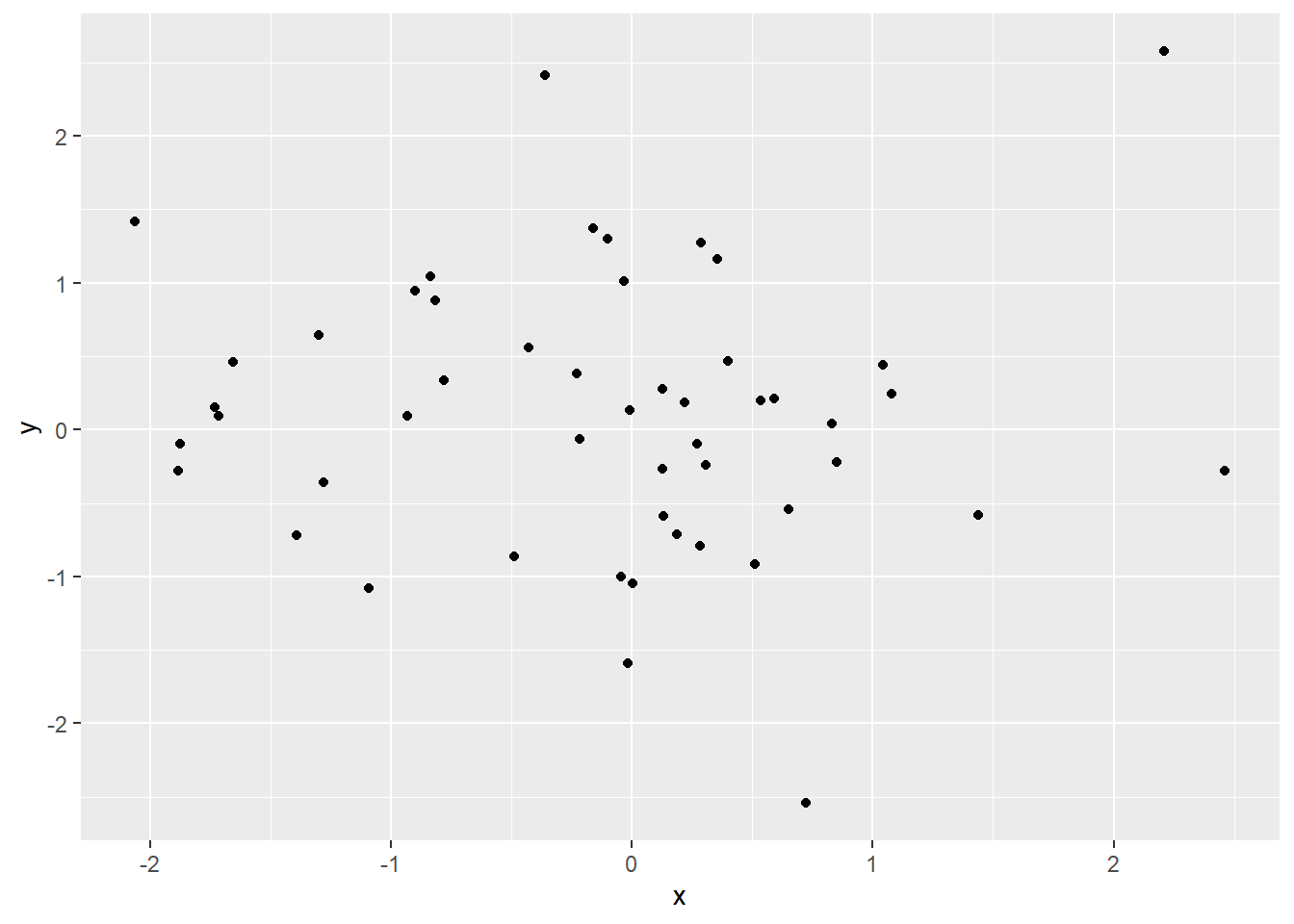
Exercise 7: Build a tidy data frame with
tibble()containing two groups of observations: group A consisting of 100 observations with \(x^A_i, y^A_i \sim \mathcal{N}(0,0.5)\) and group B consisting of 50 observations with \(x^B_i, y^B_i \sim \mathcal{N}(3,1.5)\). Plot all points as a scatterplot and color the points groupwise.
One advantage of ggplot is its flexibility. One can add an arbirary number of layers to a plot and also change a layer’s aesthetics. This is sometimes useful when you want to create plots from different data sets or in case of untidy data sets. As a consequence the dimensions of the plotting area are automatically calculated once all layers are submitted. In basic plotting, this is more tedious, as one needs to define the plotting area when the first plot is created.
# a less simple scatter plot
n <- 50                                 # number of points to plot
x <- rnorm(n, 20 , 7)                   # independent x coordinates
y <- 2*x + rnorm(n, 0, x^0.75)          # linearly dependent y coordinates with heteroscedastic errors
z <- 0.125*x^2 - x + rnorm(n, 0, 3)     # non-linearly dependent variable with homoscedastic errors
dat <- tibble(x = x, y = y, z = z)      # build an untidy tibble with x, y and z
# create first plot
plot.1 <- ggplot(data = dat, mapping = aes(x = x, y = y) ) +  # set up  coordinate system based on dat
  geom_point() +                                              # add points
  geom_path() +                                               # add connections between points
  labs(x = "x", y = "y", title = "unstructured", subtitle = "") # change axis labels and title

# fit a linear regression model
lin.reg <- lm(y~x)
# build model string
reg.mod <- paste("est. regression: ", round(lin.reg$coefficients[1],1), "+", round(lin.reg$coefficients[2],1), "*x", sep = "")

# create second plot
plot.2 <- ggplot(data = dat, mapping = aes(x = x[order(x)], y = y[order(x)]) ) + # structured plot
  geom_point() +                                              # add points
  geom_path() +                                               # and nice path
  geom_smooth(method = "lm") +                                # add regressin line + confidence intervals
  labs(x = "x", y = "y", title = "structured", subtitle = reg.mod) # change axis labels and title

# create second plot
plot.3 <- ggplot(data = dat, mapping = aes(x = x[order(x)], y = y[order(x)]) ) + # structured plot
  geom_point() +                                              # add points
  geom_point(mapping = aes(x = x, y = z), color = "red") +    # add points z
  geom_smooth(method = "lm") +                                # add regressin line + confidence intervals
  geom_smooth(mapping = aes(x = x, y = z), color = "red", method = "loess") +  # add smoothing line + confidence intervals
  labs(x = "x", y = "y", title = "structured", subtitle = reg.mod) # change axis labels and title

library(gridExtra)    # load package for plotting multiple ggplots in one device
grid.arrange(plot.1, plot.2, plot.3, ncol=3)  # print both plots side by side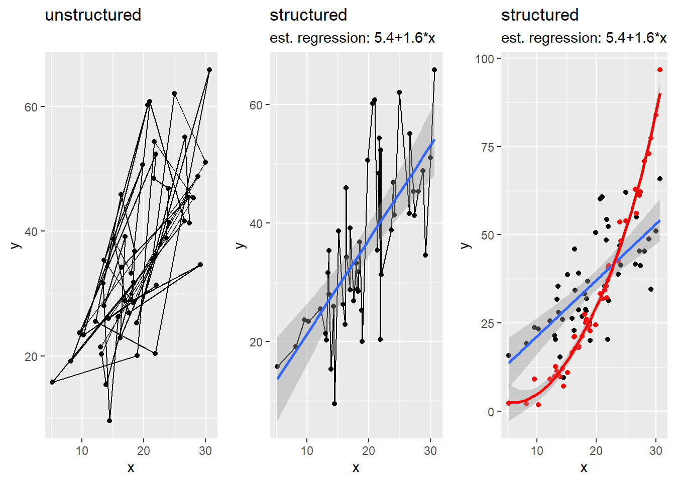
Exercise 8: The data set above is untidy. Create the same data set in a tidy way and recreate the plots above.
Exercise 9: Alter the structured plot by connecting points by arrows. Test other smoothing methods offered by
geom_smooth. Add three different smoothing functions to the plot.
To plot functions with ggplot, stat_func()can be used. It behaves as an ordinary geometrical object, except that only the x coordinate needs to be defined in aesthetic mappings. The y coordinates are automatically created by applying the defined function on the x-values.
# plot a normal distribution
n <- 50                                 # sample size
dat <- tibble( x = rnorm(n) )           # sample from standard normal distribution
est.mu <- mean(dat$x)                   # estimate mean
est.sd <- sd(dat$x)                     # estimate standard deviation
# plot histogram with density (default plots frequencies), specify plot range explicitely
col.vec <- c("theor. density" = "red", "est. density" = "blue") # set color vector
ggplot(dat , aes(x = x)) +              # set up plot
geom_histogram(binwidth = 1/3, aes(y=..density..), colour="black") + # plot density histogram, default is frequency
  stat_function(fun = dnorm, args = list(mean = 0, sd = 1), mapping = aes(colour = "theor. density"), xlim = c(-3, 3)) +  # add theoretical density
  stat_function(fun = dnorm, args = list(mean = est.mu, sd = est.sd), mapping = aes(colour = "est. density"), xlim = c(-3, 3)) + # add estimated density
  scale_colour_manual(name="Densities",values = col.vec) + # define legend structure
  theme(legend.position = "right")                         # add legend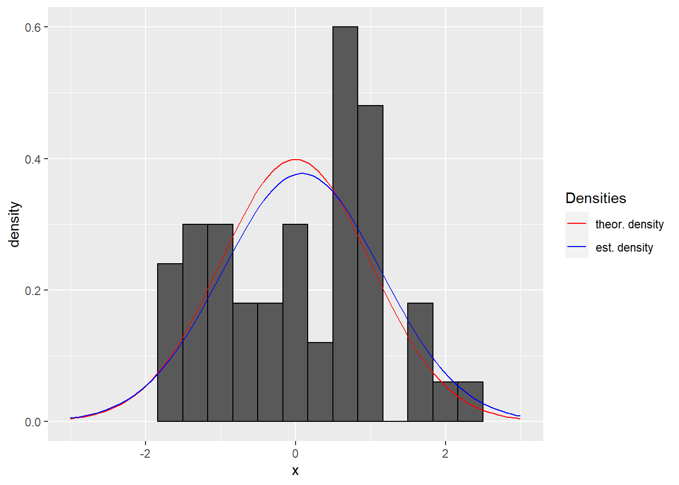
Exercise 10: Create a random sample \(S = S_1 \cup S_2\) consisting of 50 obersations with \(S_1 \sim \mathcal{E}(0.5)\) and 20 observations with \(S_2 \sim \mathcal{N}(3, 1)\). Plot a histogram of the sample overlaid with the theoretical exponential and normal distribution. (Hint: Use
rexp()to sample from the exponential distribution.)
Working with plot primitives like line segments is quite similar for ggplot and basic plotting. The same holds for plotting arbitrary functions. However, filling areas under functions is simpler.
# plot a normal distribution
q95 <- qnorm(0.95)                                                              # 95%-quantile
plot.1 <- ggplot(data = data.frame(x = -4:4) , aes(x = x)) +                    # set up plot
  stat_function(fun = dnorm, args = list(mean = 0, sd = 1)) +                   # add density
  geom_segment(aes(x = q95, y = 0, xend = q95, yend = 0.4), size = 1.25, color = "grey", linetype ="dashed") + # add vertical line
  stat_function(fun = dnorm, args = list(mean = 0, sd = 1), xlim = c(q95, 4),  geom = "area") + # add 5%-area
  annotate(geom="text", x=q95, y=.42, label=paste("95%-quantile =", round(q95,2)))              # annotate 95%-quantile

plot.2 <- ggplot(data = data.frame(x = -4:4) , aes(x = x)) +        # set up plot
  stat_function(fun =  function(x) {sin(0.75*x - pi)  + 0.125 * x ^ 2 + x/10} )  # add theoretical density
library(gridExtra)
grid.arrange(plot.1, plot.2, ncol=2)                                # print both plots side by side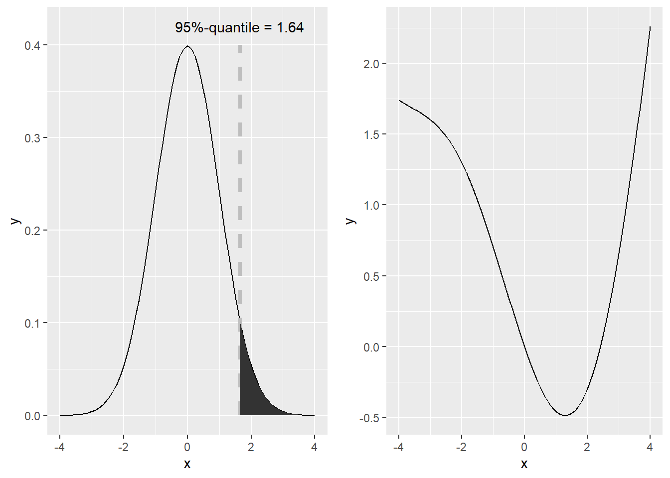
Exercise 11: Plot the standard exponential distribution, mark 95%-quantile and highlight the area under the density curve beyond the 95%-quantile.
One of the most powerful visualization tools for comparing numerical variables between groups are boxplots. While boxplots visualize summary statistics but not the distribution of the data within each group, violine plots display the (kernel) density estimates and, thus, the distribution of the data. This is particularly useful for multi-modal data. Moreover, violine plots can be extended by integrating traditional boxplots. Both can be created fairly easily with gpplot
# compare subsets sampled from mixed distributions
n <- 50
dat <- tibble(id = rep(c("A","B"), each = 2*n),             # create id vector identifying subsets
       value = c(rexp(n, 1/5), rnorm(n, -6, 2),                          # subset A
                 rnorm(n, 0, 2), 8+rweibull(n, shape = 0.5, scale = 1))) # subset B
ggplot(data = dat , aes(x = id, y = value, fill = id)) +    # set up plot
  geom_boxplot(width=0.1) +                                 # add boxplot
  geom_violin(trim = F) +                                   # add violine
  theme(legend.position="none")                             # omit legend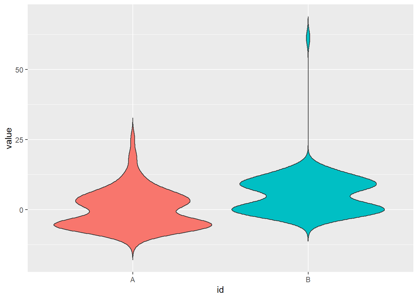
Exercise 12: Try to recreate these violine plots from an untidy data set.
5.3 Interactive plots with plotly
Plotly is a company offering data analytics web-applications. Among the various products, Plotly offers graphics libraries for various programs (including Python, R, Matlab, etc.). With plotly more or less automatically interactive graphics are created in HTML. For more information see https://plotly.com/r/.
Plotly has a similar syntax as ggplot but with higher degree of automation. I.e., an advantage of plotly is that usually ony plot_ly() is required to create a basic plot whereby the type of the plot is “deduced” from the supplied arguments as well as the arguments type and mode.
library(plotly)
data("iris")                                                                                           # load iris data set
fig1 <- plot_ly(data = iris, x = ~Sepal.Length, y = ~Petal.Length, text = ~Species)                    # simple Scatterplot
fig2 <- plot_ly(data = iris, x = ~Sepal.Length, y = ~Petal.Length, color = ~Species, text = ~Species)  # grouped Scatterplot
fig3 <- plot_ly(iris, x = ~Species, y = ~Petal.Width, type = "box")                                    # Boxplot
fig4 <- plot_ly(iris, x = ~Sepal.Length, color = ~Species, alpha = 0.6) %>% layout(barmode = "overlay")# overlaid histograms

subplot(fig1, fig2, fig3, fig4, nrows = 2)                                                             # subplots
Similar to ggplot, plotly works with overlays. I.e., you can add different objects to a plot. Correspondingly one can convert ggplots into plotlys.
lm.iris <- lm(Petal.Length ~ Sepal.Length * Species , data = iris)        # linear model relating petal and sepal length per species
fig.1 <- plot_ly(data = iris, x = ~Sepal.Length, y = ~Petal.Length, color = ~Species, text = ~Species, type = "scatter")  # grouped scatterplot
fig.1 <- fig.1 %>% add_lines(y = predict(lm.iris)) # add regression lines

fig.2 <- ggplot(data = iris, mapping = aes(x = Sepal.Length, y = Petal.Length, color=Species)  ) + # structured plot
  geom_point(aes(color = Species)) +                          # add points
  geom_smooth(method = "lm")                                  # add regression lines + confidence intervals
subplot(fig.1, ggplotly(fig.2), nrows = 2, shareX = TRUE)
Plotly is often used to create some fancy plots like 3D plots.
# vectoried function for bivariate normal distribution
norm.dens.2d.fun <- function(x, y , mu.vec = c(0,0), sig.mat = diag(1,2)){
  1/ (2*pi) / sqrt(det(sig.mat)) * exp(-.5 * diag( ( sweep(cbind(x,y), 2, mu.vec) ) %*% solve(sig.mat) %*% t( sweep(cbind(x,y), 2, mu.vec) )  ) )
}
x.vec <- y.vec <- seq(-3, 6, length.out = 100)                              # create x and y vector
# density values
density.1 <- outer(x.vec, y.vec, FUN = norm.dens.2d.fun)                    # density values of bivariate standard normal distribution
density.2 <- outer(x.vec, y.vec, FUN = norm.dens.2d.fun, mu.vec = c(2,3), sig.mat = matrix( c(3,.7,.7,.5), ncol = 2 )) # density values of some other bivariate normal distribution
mixed.density <- (density.1+density.2)/2                                    # mixed density
# density plot
plot_ly(x = x.vec, y = y.vec, z = ~mixed.density) %>%                                                        # create plot
  add_surface(contours = list(z = list(show=TRUE, start = 0, end = .08, size = .01,  project=list(z=TRUE)))) # add surface